Change display of my mobile website
When you publish your website, the Website Builder Business and Business Plus plans (plus Personal plans bought before July 30, 2014) automatically create a mobile version as well. It doesn't require any extra steps from you. When visitors come to your website using mobile devices, they see a version tailored to their screen sizes, making it easier to view and navigate.
For that reason, you would ordinarily leave on the display of the mobile version. If you do not want it to display, however, you can easily turn it off. Visitors with mobile devices then will simply see the non-mobile version. If you change your mind, you can just as easily turn back on the display of the mobile version.
- Log in to your HostingDude.com account.
- In your Products list click Website Builder, and then click Manage next to the account you want to use.
- Click Edit Site.
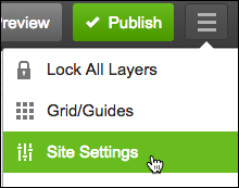
- In the top right corner of your screen, click the three-bar icon (Manage Settings) and select Site Settings in the dropdown menu.

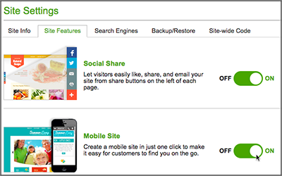
- In the Site Settings window, click the Site Features tab and click the Mobile Site button to set it OFF or ON.

- Click OK to close the window.
- Click the top-right Publish button, which posts your new setting and turns off or on the display of your mobile website.
How Site Settings Affect Your Mobile Website
You cannot directly change the design or layout of your mobile website. Instead, it's yoked to your site's non-mobile pages. Website Builder automatically adjusts the display of those pages to suit the proportions and dimensions of the device on which they're displayed.
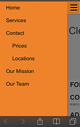
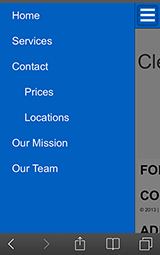
Unless you manually change your navigation menu settings, your website's theme largely controls the appearance of your non-mobile navigation menus. That, in turn, dictates the appearance of your mobile site. In this example using the Consulting Service theme, the non-mobile and mobile sites use the same orange background. But the text color and other background colors of the non-mobile site are not used in the mobile version.


Note: Don't be tempted to change the menu's appearance by changing your theme: doing so removes all your existing text, images, and settings from the site (more info). Instead, leave the theme alone and manually change your text and background colors in the Navigation Settings window. (See Customize your navigation menus and Organize pages with navigation menus.)
The menu's manual settings may look quite different on your non-mobile website compared with the mobile version. You may want to experiment with those settings to see how they affect the mobile site's menu arrangement and the colors of text links and backgrounds.
For example, here's how the same settings for text link colors, background colors, and page menus look on your non-mobile website (top) compared with the mobile website (bottom).

