Troubleshooting Extra Space in Outlook Display
When designing emails to send to your subscribers, whether you're using custom HTML or the standard Email Marketing composer, I know you're already considering how that email will look, across all the major email clients. And if you've struggled, at all, with your email showing extra space in Outlook, you've come to the right place.
First of all, it's important to recognize that Outlook uses the proprietary Microsoft Word rendering engine, to display HTML code. This engine uses some different algorithms and styling than most other email clients, in order to visualize that HTML. This can lead to some very frustrating troubleshooting, with seemingly Outlook-only problems arising.
What's the problem?
Now, there's an interesting issue having to do specifically with extra vertical space appearing in your final email, but only in Outlook. This has to do with -- you guessed it -- that Word rendering engine.
The Word engine uses page definitions to force breaks in your code. Microsoft calls these text boundaries and they are pretty much the same thing as a page break. In email, this break should be seamless. But in Word, it isn't. So, Outlook will actually render that break, like only Outlook can!
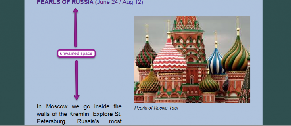
Using the standard composer, you will only ever see this with images. Sometimes the page break appears in Outlook above the image, and sometimes below it. In even weirder cases, Outlook will render the image on the first 'page', and then push any text that should be next to it, on to the 'page' below:

The page size that Outlook will limit you to is 23.7 inches tall, or about 1790 pixels. This means if you have any tables, or images, or other single elements in your code that are longer than that, Outlook will force that break in your content -- literally showing it as blank space.
Thanks to Michelle, over at Email on Acid, you can read all about the nitty gritty details of this issue, if you want to dive in over there. In our testing, the worst occurrence seems to be in Outlook 2010, over other versions. And, there could be light at the end of the tunnel, since we aren't seeing this happen, at all, in Outlook 2013.
Ok, got all that. Now, how do I fix it?
If you're using the standard composer, the absolute simplest suggestion for getting rid of this space is to adjust the content above where that space is happening. This will change the HTML code of the campaign, most likely changing where the break occurs. You can add more text above, add a divider, or even change the size of any image to try and knock that break into place.
If this is happening and you have a very large image, the best solution is to simply reduce the size of that image. The image, itself, is most likely what is causing that unwanted break, in your email.
If this is your own, custom HTML, however, first check your code for any large or nested tables. You want to look for anything that might possibly span more height than 23.7 inches or 1790 pixels. Try breaking these tables apart, or specifying a height attribute for the table that is being broken. This can limit the amount of blank space that Outlook generously provides in that break.
Next up, you can try any of Michelle's suggestions in that Email on Acid article, including inserting a page break right above the element that's being broken weirdly, or specifying a height attribute for the table that's being broken.